Boston Celtics logo (Photo by Jim Rogash/Getty Images)
Logo redesigning is not something the fans appreciate. They like to preserve the sentimental value of their favorite team’s logo, representing their history. However, what graphic designer Emily Morgan does is nothing short of art. Emily made herself a prominent face on social media with her various logo redesigns, and now she has added the Boston Celtics to that list.
The leprechaun in the logo is something the Celtics fans take very seriously; ask Kyrie Irving, who did something unthinkable during his time with the Nets. Emily kept the leprechaun in her new logo as well but added a more animated touch to it in this era. The initials of the team name have been combined into a crest resembling soccer and baseball teams, with the leprechaun in the middle. Here’s the final look:
Shortly after the new Celtics’ logo was posted, social media took notice and showered their appreciation for Emily’s work. Of course, not everyone likes it, but the admirers outshined the naysayers. Here are some of the comments from the thread from X (formerly known as Twitter):
An impressed fan wrote, “I don’t always love the logo redesigns because I’m cranky and hate change. But this is my favorite one. Really nice work on this.”
Someone wrote, “You are elite.”
Another added, “i actually dig this a lot.”
“This is so fire,” wrote a fan.
Among the praises, a disgruntled fan commented, “No. Others you have done are great. Don’t f*ck with this classic.”
The last person probably would’ve thrown a fit in the 1900s when the Boston side underwent multiple logo redesigns before finally sticking to the current one.
How Did Boston Celtics Logo Evolve Throughout the Years?
The Boston Celtics were established in 1946, and the logo used in its early days is nothing like the one we see today. Back then, a white shamrock leaf was placed inside a circle with Celtics written above it. The leprechaun was introduced in 1950, and since then, it has remained with the logo. A jumping leprechaun was introduced in the logo with a shamrock leaf-printed jacket and a crown with NBA lettering engraved on it.
The jumping leprechaun became a standing one like the one we see now in 1968 with a red basketball behind it. In 1974, another change happened as the basketball was removed in favor of a green circle around the leprechaun with Boston Celtics written on it.
The logo was left untouched for over 20 years till 1996, when the final redesign occurred. The leprechaun now clads a black pant with matching boots, and a moss-green jacket was pulled over. The green shade went darker, symbolizing stability alongside the white and green colors, representing growth and progress.
The current logo is one of the most recognizable sporting logos in the world, and fans hope that it sees the franchise’s 18th Larry O’Brien trophy win before any possible remodeling.
News

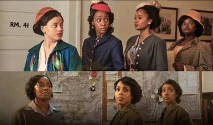
Kerry Washington Leads All-Star Cast in First Teaser for Tyler Perry’s WWII Drama, ‘The Six Triple Eight’
Netflix has officially announced the release schedule for Tyler Perry’s highly anticipated WWII drama, The Six Triple Eight, starring Emmy winner Kerry Washington. The film will premiere in select theaters on December 6, followed by a global release on the…

Jasson Dominguez’s lightning-quick triple reminds us how much he could impact Yankees
Milwaukee Brewers v New York Yankees / Rich Schultz/GettyImages Here’s your friendly mid-week reminder that New York Yankees outfielder Jasson Dominguez isn’t your typical power-only physical freak. Like the hulking Spencer Jones, he also has a sprinting side. Yes, we…
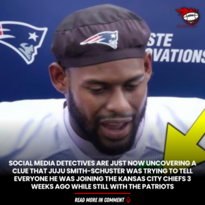
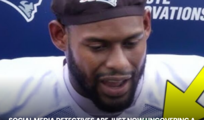
Social Media Detectives Are Just Now Uncovering A Clue That Juju Smith-Schuster Was Trying To Tell Everyone He Was Joining The Kansas City Chiefs 3 Weeks Ago While Still With The Patriots
JuJu-Smith Schuster (Photo via New England Patriots/YouTube) Observant social media detectives uncovered compelling evidence indicating that JuJu Smith-Schuster knew well in advance that he was Kansas City-bound. While he was still with the New England Patriots, no less. The Patriots released JuJu Smith-Schuster on Aug….
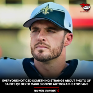
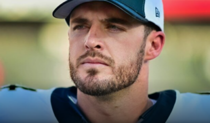
Everyone Noticed Something Strange About Photo Of Saints QB Derek Carr Signing Autographs For Fans
Derek Carr (Photo by Julio Aguilar/Getty Images) NFL fans noticed something interesting about Derek Carr and New Orleans Saints fans while he was signing autographs for them. Derek Carr is entering the second season of a lucrative four-year, $150 million contract he signed with New Orleans…

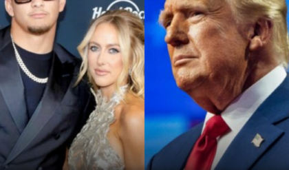
Chiefs QB Patrick Mahomes Offers Firm Statement On His Political Beliefs After Wife Brittany Publicly Endorsed Donald Trump
Patrick and Brittany Mahomes and Donald Trump (Photos via Getty Images) Folks expecting a political endorsement by Kansas City Chiefs quarterback Patrick Mahomes better not get their hopes up. Patrick Mahomes’ wife, Brittany, made headlines last week when fans noticed she “liked”…

VIDEO: Connor Stalions Exposes Former Michigan Head Coach Jim Harbaugh For A Gift He Gave Him For His Sign-Stealing Performance After A Big Game
Connor Stalions and Jim Harbaugh (Photos via UnnecRoughness/Instagram) Connor Stalions was the focal point of a Netflix documentary, “Untold: Sign Stealer,” which was released on Netflix. It appears Connor Stalions had a big hand in the Michigan Wolverines’ 2022 win…
End of content
No more pages to load