Almost.
There has been a lot of discourse around the MLB’s uniforms this season. With Fanatics taking the reigns as the league’s primary distributor, there has been a conspicuous drop in quality — not only for customers at home, but for the players on the field.
From see-through pants to completely horrid design choices (we can probably blame Nike for that bit), the league hasn’t been able to avoid fan ridicule. Baseball is a sport, but the MLB is a business. Merch is an essential aspect of that business, and not providing your fans (or players) with decent jerseys to purchase is malpractice.
It all feels like a callous cash-grab from the MLB higher-ups.
Few uniform decisions have received more universal condemnation than the Philadelphia Phillies’ new City Connect threads. Donned in every Friday home game, the uniforms feature a, uh, distinct color palette. Light blue and yellow, which we all know is not anywhere close to Philadelphia’s normal color scheme.
There have been a few creative, truly wonderful outside-the-box City Connect jerseys over the years — lookin’ at you, San Diego — but these Phillies threads ain’t it. I am personally not as aggrieved by them as others, but it doesn’t look like the sort of uniform you’d expect in a professional baseball league. That is the sort of look the wealthy rec softball team at a giant tech corp in Silicon Valley commissions, ya know? Strong Cybertruck-in-jersey-form vibes.
It certainly does not “embody the city,” other than incorporating the colors on the Philadelphia flag. As we know, Philadelphians care deeply about their flag colors (read: with sarcasm).
This all could have been avoided with a different design. Or, better yet, a different color scheme. The basic outline of the jersey is mildly appealing. Why not, I don’t know, make it red. A new series of photos from Uniwatch shows us what could have been.
Red City Connect jersey should what could have been for Phillies
It’s not immediately clear how “real” these red City Connect threads are, but most signs point to them being fake. Primarily the fact that this is just not a real uniform currently used by the Phillies. A most optimistic conspiracy theorist might dub this an “early prototype,” but in reality, it’s just a good idea from a bootleg manufacturer that the Phils should steal for next season.
That uniform looks immensely better than the blue-yellow abominations currently on display every other Friday. Even as a more neutral observer of the blue-yellows — I wouldn’t use the word abomination, but every other Phillies fan would — the difference in aesthetic quality is night and day. When the fake jerseys start looking better than the real ones, you know there’s a problem.
Odds are, we never get to see these red unis in game action, which is a bummer. So much of the beauty in life can be stymied by greedy corporations. Fanatics, this is your chance to right wrongs and bring happiness to a fandom in need.
Until then, Philly fans can take solace in their utter dominance of a weak National League.
News
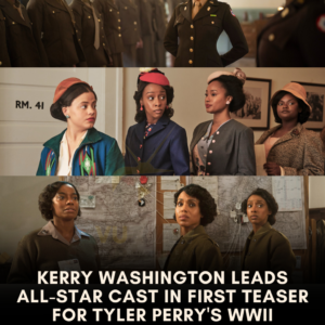
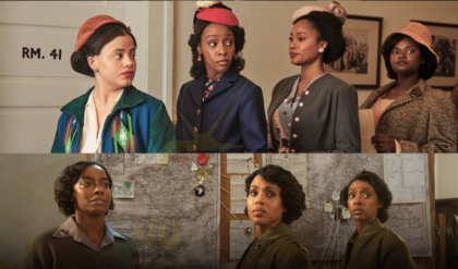
Kerry Washington Leads All-Star Cast in First Teaser for Tyler Perry’s WWII Drama, ‘The Six Triple Eight’
Netflix has officially announced the release schedule for Tyler Perry’s highly anticipated WWII drama, The Six Triple Eight, starring Emmy winner Kerry Washington. The film will premiere in select theaters on December 6, followed by a global release on the…
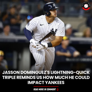
Jasson Dominguez’s lightning-quick triple reminds us how much he could impact Yankees
Milwaukee Brewers v New York Yankees / Rich Schultz/GettyImages Here’s your friendly mid-week reminder that New York Yankees outfielder Jasson Dominguez isn’t your typical power-only physical freak. Like the hulking Spencer Jones, he also has a sprinting side. Yes, we…
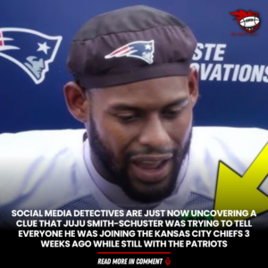
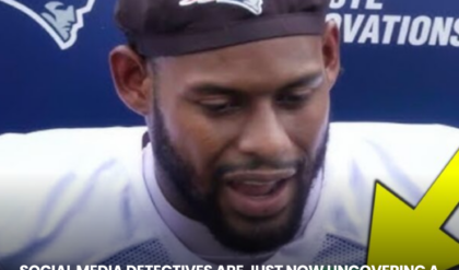
Social Media Detectives Are Just Now Uncovering A Clue That Juju Smith-Schuster Was Trying To Tell Everyone He Was Joining The Kansas City Chiefs 3 Weeks Ago While Still With The Patriots
JuJu-Smith Schuster (Photo via New England Patriots/YouTube) Observant social media detectives uncovered compelling evidence indicating that JuJu Smith-Schuster knew well in advance that he was Kansas City-bound. While he was still with the New England Patriots, no less. The Patriots released JuJu Smith-Schuster on Aug….
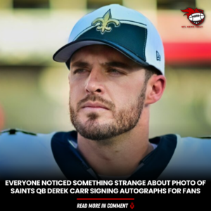
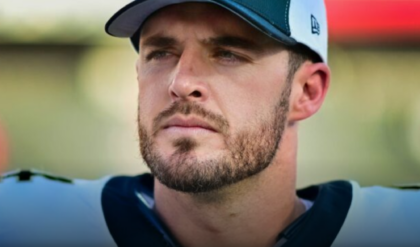
Everyone Noticed Something Strange About Photo Of Saints QB Derek Carr Signing Autographs For Fans
Derek Carr (Photo by Julio Aguilar/Getty Images) NFL fans noticed something interesting about Derek Carr and New Orleans Saints fans while he was signing autographs for them. Derek Carr is entering the second season of a lucrative four-year, $150 million contract he signed with New Orleans…
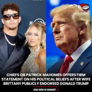
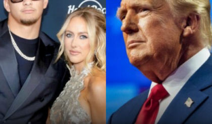
Chiefs QB Patrick Mahomes Offers Firm Statement On His Political Beliefs After Wife Brittany Publicly Endorsed Donald Trump
Patrick and Brittany Mahomes and Donald Trump (Photos via Getty Images) Folks expecting a political endorsement by Kansas City Chiefs quarterback Patrick Mahomes better not get their hopes up. Patrick Mahomes’ wife, Brittany, made headlines last week when fans noticed she “liked”…
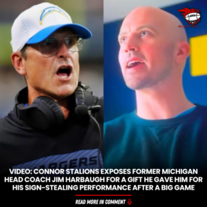
VIDEO: Connor Stalions Exposes Former Michigan Head Coach Jim Harbaugh For A Gift He Gave Him For His Sign-Stealing Performance After A Big Game
Connor Stalions and Jim Harbaugh (Photos via UnnecRoughness/Instagram) Connor Stalions was the focal point of a Netflix documentary, “Untold: Sign Stealer,” which was released on Netflix. It appears Connor Stalions had a big hand in the Michigan Wolverines’ 2022 win…
End of content
No more pages to load